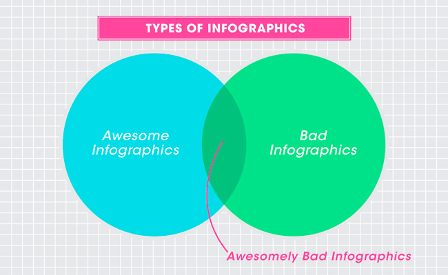
Quit it With All the Infographics Already [Infographic]
The latest edition of GOOD magazine, which has long had a thing for infographics anyway, is the Data Issue. While I feel GOOD shoulders the blame for popularizing infographics, they at least still do it well. The explosion of infographic use (and abuse) in the last few years could simply be an effect of data overload combined with too many people having Illustrator licenses. But it’s seriously getting out of hand.
Photo from Grist.org
What’s the big deal? Everybody’s doing it, right? If you put [Infographic] in a blog post title, people are going to click on it, because they straight up can’t get enough of that crap. Flowcharts for determining what recipe you should make for dinner tonight! Venn diagrams for nerdy jokes! Pie charts for statistics that don’t actually make any sense! I have just one question—are you trying to make Edward Tufte cry? ....continue reading on howinteractive
What Google’s Material Design Is Really About
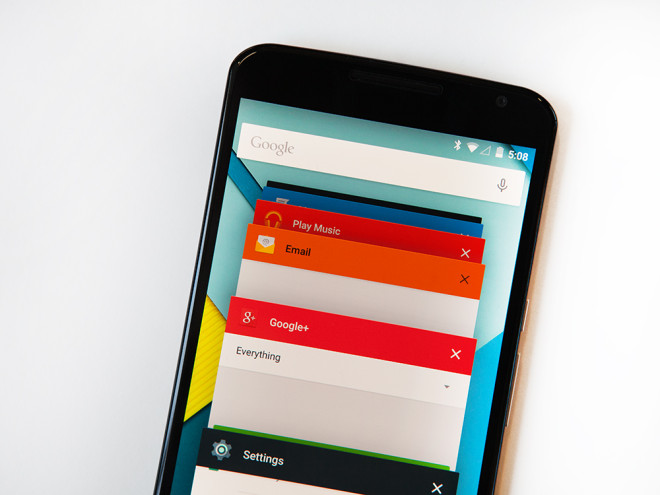
With the November release of Android Lollipop, Google’s Material Design language has begun making its first appearances in the wild. Designers and technologists everywhere are aflutter with praise for the new design language, which aspires to unite Google’s expansive product line under a rich set of design styles and principles.
Google’s Android 5/Lollipop. Alex Washburn / WIRED
The visual details are delightful, and the paradigmatic underpinnings — that interfaces are three-dimensional constructions, composed of layers of “physical” components — are refreshingly novel. But I’ll spare you more “oohs” and “aahs” over the language’s use of bright colors, large images, and depth. If we take anything from Material Design it isn’t how to use color, how your ease timing should be set, or what the resting elevation of an object should be. It’s not the details themselves we take away, it’s how the details combine to create purposeful brand experience.